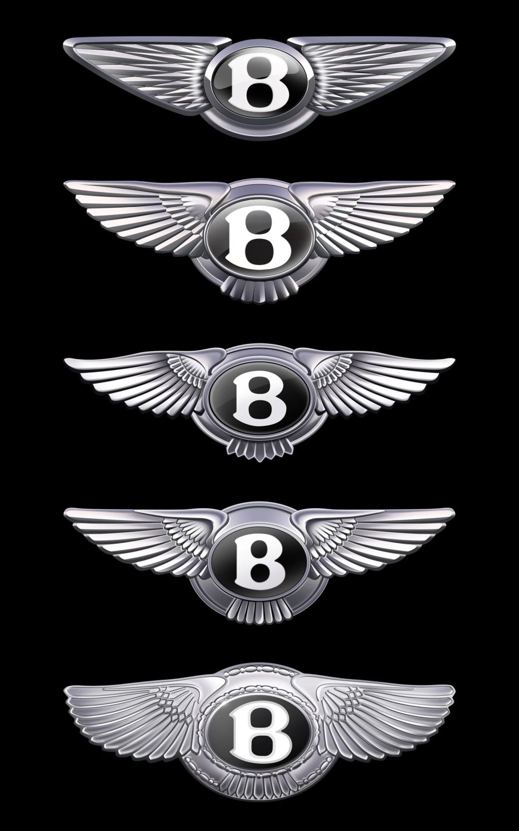
Bentley has unveiled a simplified version of its familiar emblem, Winged B, marking only the fifth rebrand since the automaker founded more than a century ago.
Created by Bentley’s in-house design team, led by design director Robin Page, the logo is the first revelation of a “new era of Bentley’s design language”. The logo will appear on a set of concept cars that will be revealed next week. The company’s original logo was designed by illustrator F Gordon Crosby in 1919 and has only been updated three times since then – in 1931, in the 1990s, and in 2002.
The most profound change in more than a century
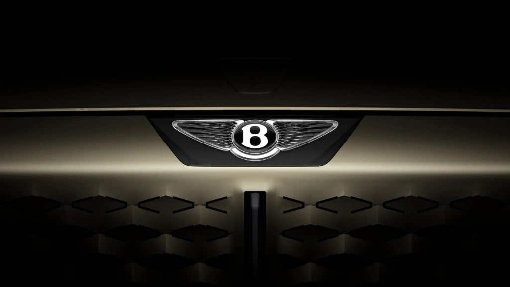
According to Bentley, the latest iteration, which was based on a concept by interior design team member Young Nam, is “the biggest instantly recognizable brand change in more than a century of history.” The main elements of the winged letter B emblem remain, but the wings have been simplified and stylized with a diamond-shaped pattern, while the feathers under the central letter B have been completely removed for the first time.
According to the design team, the sharper shape “is reminiscent of the angular wings of a peregrine falcon.” In the center of the emblem, the letter B has been given the appearance of being surrounded by a beveled metal ring with a beveled glass edge, so that it can be used as a wingless graphic element. “If a luxury brand is the product of the stories it has created, then its emblem is its signature,” said Robin Page, Bentley’s design director.
115 years of Alfa Romeo passion: between emotion, design and marine spirit
“In an era of increasing complexity and fidelity due to digitalisation, an exercise in simplification and refinement is a modern necessity – and therefore the new emblem is cleaner, clearer and more impactful than its predecessor. The new Winged B – and the concept car that introduces it – both symbolizes a strong and exciting future for this company and its exceptional, handmade products,” he continued.
Bentley, on the line opened by other Premium and luxury brands
The company also revealed a flat, drawn-line version of the logo, which is expected to be used as part of the branding, in an announcement video. Bentley is the latest car brand to unveil a simplified logo, with Audi creating a flat version of its distinctive four-ring logo, and Peter Saville creating a “subtle but necessary” update to the Aston Martin logo. Last year, the Jaguar car brand caused a stir with its “unique and fearless” rebranding, which was met with negative reactions online.


Comentați?